NU
This is a short Danish film from 2002. Although not horror, the film has a haunting affect on the viewer. The film is split into two segments, a young, recently married couple, and an two old men in a hospital. The plot follows that of a young couple with a child and the husband's affair with another man. It effectively uses elements of horror to shock the viewer.
The film is entirely in black and white and has no dialogue, like ours. The only sound is the diegetic sound of a baby crying, which has been distorted to make it sound unnatural, almost demonic. However, it is very difficult to create an entirely silent film, as the actions of the characters need to be very clear and almost exaggerated in order for audience to follow the narrative. We would find the this challenging, to do and have therefore decided to make our opening silent instead. This convention is often used to create an aura on intrigue and mystery, instantly hooking the viewer to the film. Also like our film, it focuses on one narrative story and the characters involved, it does not side step to follow different characters. NU's narrative however, takes place at two different time, past and present, while our remains rooted in the present. However, if we were to continue filming our film, I think we would find that we would need delve into the past in order to explain certain plot points.Our film also makes use of a hidden identity, in order to further interest the viewer, a convention that NU uses as well to shield the identity of the Husband's lover.
In terms of film openings, ours is more original, but NU's is simpler and therefore more effective. It uses monochrome backgrounds and letters, with the font large and very readable. We used calligraphy for our film title as we thought it reflected the Gothic horror genre well.

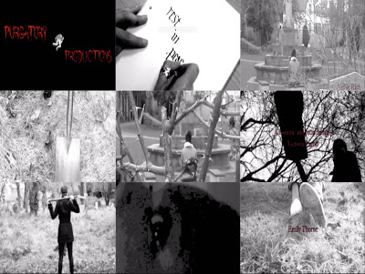
In the first frame, is our production logo. Naturally we chose this as it is an important part of a film, it part advertisement, part informative. It informs the viewer who has produced the film and encourages them to see what other films they have produced.
The third frame is our setting/location. We chose a mid-long shot in order for the audience to see the location better and to see one of the characters.
We chose this location in order for the audience to know that wherever you are then anything can happen to you whether you know it or not. The fact that she next to a church would make you think that she is at least protected but she's not.
The fourth frame shows one of the props we have used--the shovel. It also shows part of the shoes our antagonist is wearing. The antagonist is shown from the back so the audience doesn't really get a clear view of the antagonist because the face is not shown. This gives the audience a burning desire to find out who the character is and what their background story could be. This is the shovel used to dig up the grave for the burial of the protagonist.
The fifth square represents camerawork and editing, though mostly camerawork. The shot here is a long shot, with the protagonist framed by the branches and evident thorns. The mis- en- scene here is interesting, and was captured by our camerawoman.
The next shot is of the antagonist burying the main character, with the shovel. This represents our story as the title is, 'Rest In Peace' and this shot conveys to the audience the pinnacle of our opening scene, when we see the protagonist buried alive.
The next shot is of the antagonist, with the shovel sitting across the back of her shoulders. I have chosen this shot because it highlights the fact that our antagonist is a female, as opposed to horror films that commonly use a male as the antagonist. One could say that the antagonist looks extremely satisfied with what she has done depending on her body language.
The eighth shot is of our protagonist waking up from being unconscious. In this shot the protagonist looks confused as to where she is as we can see from the extreme close up of her eye. We decided to use this to emphasise the fact that she is not dead but just buried alive and it can make it easier for the audience to understand. It was pretty hard with this shot because we didn't have enough light and we had to keep changing the effects because we couldn't find the perfect effect to use but we finally found it. We used the clip effects on iMovie to do this.
The last and final shot is of the protagonist's feet being dragged along the ground. This is the instance when she is knocked unconscious for the antagonist to bury her in a grave.
[NEED TO FINISH0
No comments:
Post a Comment