Wednesday, 20 March 2013
Main Task
Our completed final task:
In the end, we decided to not include the adapted Ted Hughes poem voice-over as it clashed with the music. The voice-over was fine on its own, as was the music, but combined they were confusing, making us to choose one or the other. We chose the music as it created more suspense, and the voiceover may have created confusion with the viewer.
Tuesday, 19 March 2013
Monday, 18 March 2013
Question 7: Looking back at your preliminary task (the continuity editing task), what do you feel you have learnt in the progression from it to full product?
In retrospect, I believe we have improved significantly in terms of planning, handling the equipment, filming and the process of editing. Previously, we were insecure about what we were doing and how to do it, during which we also learned to take the filming process more seriously. Furthermore, we learned the importance of planning, and how, without it, filming falls into chaos. In addition, planning allows the intergration of various less obvious details. We conducted research in the various different types of horror before deciding on Gothic Horror, as it was the more unusual and less noticed genre in terms of recent films. In combination with film theory, I now have a deeper understanding of the messages conveyed through different angles and shot compositions, allowing me to apply them not only in class but also when watching films in my free time. This combination of learning has made the progression from a rudimental first attempt to a full product easier and has enabled me to produce higher quality films, as well as provide mw with new skills.
Sunday, 17 March 2013
Evaluation Question 6: What have you learnt about technologies from the process of constructing this product?
Below are the tutorials we created to demonstrate what we have learned, thus answering the question above. Using YouTube, we added, we added annotations to explain what we were doing.
Saturday, 16 March 2013
Evaluation Question 5: How did you attract/address your audience?
 |
| ORIGINALLY LARGER- WRITING EASIER TO READ |
We decided to keep our poster simple so not to detract from the plot of our film. Our poster was inspired by Arthaus in its style, and uses a font that combines elements of Cassandre's 1937 Peignot and the Broadway font, creating a Gothic font that almost mirror that originally on the gravestone (R I P), indicating to our audience that the film is of a Gothic nature. The photograph for the background was taken in the graveyard where we filmed our movie, the outcome of the being something of a personal nature to the audience, they see a film of an event occurring after having seen the poster. We decided to make the picture black and white to keep within the conventions of old Gothic Horrors. Overall, the choices we made were in order to attract our audience, inform them of the genre and create an original, non-typical poster.
Below are the questions and interviews we conducted with our audience.
Questions for our audience: If given the chance would you like to see more of the film?
Is there anything you think would improve the film?
Is there anything you find confusing?
Was there anything you didn't like or found distasteful?
Do you relate to the film?
Do you think it fits with the conventions of a gothic horror film?
Did the poster attract you to see the film?
What did you think of the colour scheme and the music?
From these responses, we can see that, generally, people find it interesting and would like to see more of it. However, they believed that we should work on our editing as they found that our opening titles were too fast and that the other titles did not fit as well as the others did. Understandable as this is, it was difficult to film the writing of the calligraphy, due to the hand being in the way, but that is no real excuse. It did have to be sped up, as it takes a while to write, if it is meant to be clean and sharp. Our interviewees also found that the lighting in the final coffin sequence was appropriate, with which we agree. It was a difficult scene to film and we had to simply suffice with a torch in a cupboard. We would have used a more inventive and imaginative approach if we hadn't been under a time limit with no budget. Our interviewees generally agreed, with one objection, that the colour scheme matched the atmosphere of the film. An objection was raised was that it needed to be darker, but I find that if it were darker, some shapes might have become indistinguishable. We had decided to keep the film in black and white and at that level of contrast in order to keep within one of the main conventions of Gothic Horror. The one question where most agreed (negatively) was on whether or not they could relate to the film. I believe they may have partially misunderstood the question (I personally do not know many people who have been buried alive). Its actual line of enquiry was whether or not they felt that they had a connection in general to the film, not if they had had a similar experience. The interviews also showed that our poster was effective in attracting our target audience- it fulfilled its purpose.
Friday, 15 March 2013
Evaluation Question 4: Who would be the audience for your main task?
Above are three screenshots of an example member of our target audience, Cassandra Vikander. As our target audience post explains, we wanted to have a more intellectual audience, rather than just some kids watching a film for "fun".
Cassandra Vikander is of Danish descent but was born in Pasadena, California, where her father worked as a bio chemist and her mother as a musician. As a family, they had little money until her father made a discovery about a poisonous gas that tweaked the interest of the government. Shortly after, they moved to the UK, specifically London. She showed intelligence from an early age and was admitted to Oxford University where she is taking English Literature, Women's Studies (Feminism) and Art. Her mother (Luna) died in a hospital fire three years ago, leaving her to care for her father (Marcellus) and her younger brother (Tristan). At the compulsory counseling meetings, she met her boyfriend Alec who had been a car accident resulting in his sisters death. The two recovered from their tragedies and moved on with their lives. Cassandra loves Gothic horror in all forms; film, television, novels etc. Her favourite book series being Hannibal by Thomas Harris. She also enjoys Sir Arthur Conan Doyle, Edgar Allen Poe, Robert Browning, Ian Flemming, Ted Hughes and Kathy Reichs. Her music tastes are wide reaching; she enjoys everything from Beethoven, Tschaikovsky, Mozart, David Bowie, The Smiths, The National, Panic! At The Disco, The Killers and The Jesus And Mary Chain.
Typically, she wears dark colours, usually jeans, t-shirt/blouse and a jacket. Cassie buys most of her clothes from charity or second hand stores, rarely from primary retailers. Her t-shirts are usually band/music/arty shirts, or clothes she has borrowed from her boyfriend.
Her favorite meal is steak and potatoes.
She lives with her boyfriend in the Florey building of The Queen's College near the centre of Oxford.
Thursday, 14 March 2013
Evaluation Question 3: What kind of media institution might distribute your media product and why?
Above is a short animation explaining the production/distribution company process.
Below are two more detailed PowerPoints, one each made by one pair in our group unintentionally. However, I believe that both are important and have important information. They analyze what a media institution is, how they operate and give examples of a variety of institutions.
We used ipiccy, a free online photo editing website to crop this screenshot.
Wednesday, 13 March 2013
Evaluation Question 2: How does your media product represent particular social groups ?
Example 1:
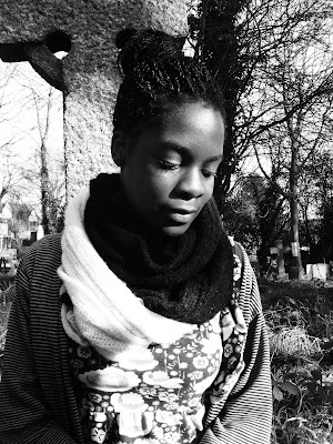
To the right is Emily Browning in The Uninvited and to the left is Cynthia Wangwe as Ava Van Camp in our film Rest In Peace. These two characters are similar in that they of a similar age, late teens. They are similarly represented as innocent and unaware of what fate will befall them, this being expressed in one way by their clothing which is pattered and lively. Browning's character (Anna) has her hair down or in a pony tail and is almost unhealthily thin, most likely due to her stint in a psychiatric clinic after the death of her terminally ill mother. (Incidentally, Ava is in a graveyard to remember her dead mother, a typical horror convention.) Having ones hair down allows one to "hide" or create a barrier from the rest of society, which Anna has done. However, Ava has her hair up, signifying that she is more confident and outgoing, and perhaps suggesting that she cares more for her appearance. Anna, as the main character of the film, has many lines, but has a very soft voice, perhaps indicating low self esteem. Our character has on lines as, so far, it is a silent film and is told (in part) from the antagonists view. In terms of cinematography, we have portrayed our character, much like Anna, as an isolated and lonely girl. Much like anyone, she is terrified when she discoverers she has been buried alive. A convention of Gothic horror genre suggests that all characters are unnaturally white (lack of blood playing a pivotal role) but as our main character is not white, we have broken with this convention. Overall, I believe we have conformed to a stereotypical teenager in a horror film: naive and innocent, isolated, (usually) mourning a loss.
Example: 2 and 3
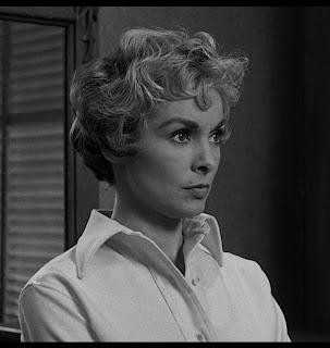
Here we have Janet Leigh's Marion Crane in the horror classic Psycho. As the film was released in the 1960's, the portrayal of the female gender was significantly different as was fashion, body image and sex appeal. In terms of fashion, women continued the practise of girdles and petticoats through out the sixties. Clothing was meant to be practical and professional, nothing more. However, in Psycho, although her dresses are certainly practical, they accentuate her feminine figure, much to the joy of male viewers. Very much like today, short hair was fashionable, and Leigh's Marion is rather fashionable, as seen by her gloves in various scenes. This idea of being an 'ideal' woman/wife/mother does not come into play at all in our film. If anything, our character is presented as a normal, slightly outcast teenage girl. Leigh's character, like most women in horror films, is continually presented as naive when staying at the motel. In some ways she does break the normal conventions of a "horror female" in that she has the nerve to steal a large sum of money and run away with her lover. The typical Gothic Horror woman is "Virginal Maiden": young, beautiful, pure, innocent, kind, virtuous. She shows these virtues by fainting and crying whenever her delicate sensibilities are challenged, usually starts out with a mysterious past and it is later revealed that she is the daughter of an aristocratic or noble family. Both Marion and Ava cannot be fitted into this stereotype, Marion more than Ava. The two characters depicted above very different, both in their ideals and in their actions. Ava is not a risk taker, although one could argue that sitting alone in a graveyard is a risk in itself, but Marion certainly is, as shown through the dialogue and cinematography. This representation of gender shows that the "real" female ideals have changed as well as those in films, as women are taking a more aggressive stance in their depiction.
The "Gothic" image for women has recently become popular, as seen by the music videos of Marina and the Diamonds.
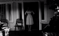
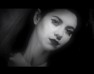
These screenshots have been taken from her video's "The State of Dreaming" and "SU-BARBIE-A", both filmed in black in white, with the first partially in colour. In "State of Dreaming" Marina wears a blood red wedding dress and veil, conforming to the stereotype of a Gothic horror maiden, as also seen by Carol Ann Duffy's poem Mrs. Havisham. Her make-up, heavy and theatrical also reflects this. The more sinister "SU-BARBIE-A"shows her standing in a door frame, the shadows of the house making her appear as if she had no head. The theme of the music and album (love, identity[homewrecker, idle teen, primadonna, beauty queen] and set in the fifties) strongly contrast the dark, ominous nature of the film; innocence taking a darker turn. The not moving form in the door suggests that she has done something wrong, yet the viewer does not know for certain. In terms of Gothic Horror, it is the perfect setting for a film and the character in the videos, Electra Heart, is very different from Ava in that she uses her innocent image to take advantage of men.
Example 4:
Mads Mikkelsen in the short Danish film NU. I though it would be interesting to compare a male character to a female character, as they can be portrayed in different ways. Mads Mikkelsen's character does not have a name, but is simply designated as the Husband. As seen in the previous characters, he is completely isolated and not content with the life he has with his wife and young child, forcing him to have an affair with a man. This character, like ours has no lines, communicating only through actions. Through out the film, he wears a black suit, white shirt and black tie, normally implying that he has an important job or that he is of high status. In the film, we see neither, in fact, we see that he is "normal", although his actions throughout suggest otherwise. He is of average of build for a man, much like Cynthia is for a woman, and his hair is kept in a normal fashion. The only outstanding feature of him being his cheek bones. This creation of a very generic person is meant to contrast strongly with his extraordinarily unusual actions, breaking typical conventions.With Cynthia, we have done the opposite, keeping within the conventions of a stereotypical teenage girl. In terms of cinematography, Mikkelsen's character is presented through close ups of his face and long shots of his remote surroundings, as seen in the picture above with a dead tree. We also broke the ethnicity convention with our film, very much like NU did, although the number of racial minority actors in films has increased dramatically in the last fifty years, as has the rise of Nordic Noir films, again intergrating and breaking the old american stereotype of "perfect" citizen. Within the representation of age, I think we did not have enough shots of Cynthia to fully show her age, but if one follows the conventions of a very typical horror film, one would find that most characters are teenagers. In Gothic Horror, this is less so as seen by the examples given above, with the exception of The Uninvited. As Gothic Horror is generally associated with vampires, the characters are stereotypically presented as eternally young. As seen both examples given above, different ages are beginning to play a prominent role in Gothic Horror- we have broken this convention.
Below are the trailers for the films/video's mentioned above.
The Uninvited:
\
Psycho:
State of Dreaming and SU-BARBIE-A
NU
To the right is Emily Browning in The Uninvited and to the left is Cynthia Wangwe as Ava Van Camp in our film Rest In Peace. These two characters are similar in that they of a similar age, late teens. They are similarly represented as innocent and unaware of what fate will befall them, this being expressed in one way by their clothing which is pattered and lively. Browning's character (Anna) has her hair down or in a pony tail and is almost unhealthily thin, most likely due to her stint in a psychiatric clinic after the death of her terminally ill mother. (Incidentally, Ava is in a graveyard to remember her dead mother, a typical horror convention.) Having ones hair down allows one to "hide" or create a barrier from the rest of society, which Anna has done. However, Ava has her hair up, signifying that she is more confident and outgoing, and perhaps suggesting that she cares more for her appearance. Anna, as the main character of the film, has many lines, but has a very soft voice, perhaps indicating low self esteem. Our character has on lines as, so far, it is a silent film and is told (in part) from the antagonists view. In terms of cinematography, we have portrayed our character, much like Anna, as an isolated and lonely girl. Much like anyone, she is terrified when she discoverers she has been buried alive. A convention of Gothic horror genre suggests that all characters are unnaturally white (lack of blood playing a pivotal role) but as our main character is not white, we have broken with this convention. Overall, I believe we have conformed to a stereotypical teenager in a horror film: naive and innocent, isolated, (usually) mourning a loss.

Example: 2 and 3
Here we have Janet Leigh's Marion Crane in the horror classic Psycho. As the film was released in the 1960's, the portrayal of the female gender was significantly different as was fashion, body image and sex appeal. In terms of fashion, women continued the practise of girdles and petticoats through out the sixties. Clothing was meant to be practical and professional, nothing more. However, in Psycho, although her dresses are certainly practical, they accentuate her feminine figure, much to the joy of male viewers. Very much like today, short hair was fashionable, and Leigh's Marion is rather fashionable, as seen by her gloves in various scenes. This idea of being an 'ideal' woman/wife/mother does not come into play at all in our film. If anything, our character is presented as a normal, slightly outcast teenage girl. Leigh's character, like most women in horror films, is continually presented as naive when staying at the motel. In some ways she does break the normal conventions of a "horror female" in that she has the nerve to steal a large sum of money and run away with her lover. The typical Gothic Horror woman is "Virginal Maiden": young, beautiful, pure, innocent, kind, virtuous. She shows these virtues by fainting and crying whenever her delicate sensibilities are challenged, usually starts out with a mysterious past and it is later revealed that she is the daughter of an aristocratic or noble family. Both Marion and Ava cannot be fitted into this stereotype, Marion more than Ava. The two characters depicted above very different, both in their ideals and in their actions. Ava is not a risk taker, although one could argue that sitting alone in a graveyard is a risk in itself, but Marion certainly is, as shown through the dialogue and cinematography. This representation of gender shows that the "real" female ideals have changed as well as those in films, as women are taking a more aggressive stance in their depiction.
The "Gothic" image for women has recently become popular, as seen by the music videos of Marina and the Diamonds.
These screenshots have been taken from her video's "The State of Dreaming" and "SU-BARBIE-A", both filmed in black in white, with the first partially in colour. In "State of Dreaming" Marina wears a blood red wedding dress and veil, conforming to the stereotype of a Gothic horror maiden, as also seen by Carol Ann Duffy's poem Mrs. Havisham. Her make-up, heavy and theatrical also reflects this. The more sinister "SU-BARBIE-A"shows her standing in a door frame, the shadows of the house making her appear as if she had no head. The theme of the music and album (love, identity[homewrecker, idle teen, primadonna, beauty queen] and set in the fifties) strongly contrast the dark, ominous nature of the film; innocence taking a darker turn. The not moving form in the door suggests that she has done something wrong, yet the viewer does not know for certain. In terms of Gothic Horror, it is the perfect setting for a film and the character in the videos, Electra Heart, is very different from Ava in that she uses her innocent image to take advantage of men.


Example 4:
Mads Mikkelsen in the short Danish film NU. I though it would be interesting to compare a male character to a female character, as they can be portrayed in different ways. Mads Mikkelsen's character does not have a name, but is simply designated as the Husband. As seen in the previous characters, he is completely isolated and not content with the life he has with his wife and young child, forcing him to have an affair with a man. This character, like ours has no lines, communicating only through actions. Through out the film, he wears a black suit, white shirt and black tie, normally implying that he has an important job or that he is of high status. In the film, we see neither, in fact, we see that he is "normal", although his actions throughout suggest otherwise. He is of average of build for a man, much like Cynthia is for a woman, and his hair is kept in a normal fashion. The only outstanding feature of him being his cheek bones. This creation of a very generic person is meant to contrast strongly with his extraordinarily unusual actions, breaking typical conventions.With Cynthia, we have done the opposite, keeping within the conventions of a stereotypical teenage girl. In terms of cinematography, Mikkelsen's character is presented through close ups of his face and long shots of his remote surroundings, as seen in the picture above with a dead tree. We also broke the ethnicity convention with our film, very much like NU did, although the number of racial minority actors in films has increased dramatically in the last fifty years, as has the rise of Nordic Noir films, again intergrating and breaking the old american stereotype of "perfect" citizen. Within the representation of age, I think we did not have enough shots of Cynthia to fully show her age, but if one follows the conventions of a very typical horror film, one would find that most characters are teenagers. In Gothic Horror, this is less so as seen by the examples given above, with the exception of The Uninvited. As Gothic Horror is generally associated with vampires, the characters are stereotypically presented as eternally young. As seen both examples given above, different ages are beginning to play a prominent role in Gothic Horror- we have broken this convention.
Below are the trailers for the films/video's mentioned above.
The Uninvited:
\
Psycho:
State of Dreaming and SU-BARBIE-A
NU
Monday, 11 March 2013
Evaluation Question 1: In what ways does your media product use, develop or challenge forms and conventions of real media products?
NU
This is a short Danish film from 2002. Although not horror, the film has a haunting affect on the viewer. The film is split into two segments, a young, recently married couple, and an two old men in a hospital. The plot follows that of a young couple with a child and the husband's affair with another man. It effectively uses elements of horror to shock the viewer.
The film is entirely in black and white and has no dialogue, like ours. The only sound is the diegetic sound of a baby crying, which has been distorted to make it sound unnatural, almost demonic. However, it is very difficult to create an entirely silent film, as the actions of the characters need to be very clear and almost exaggerated in order for audience to follow the narrative. We would find the this challenging, to do and have therefore decided to make our opening silent instead. This convention is often used to create an aura on intrigue and mystery, instantly hooking the viewer to the film. Also like our film, it focuses on one narrative story and the characters involved, it does not side step to follow different characters. NU's narrative however, takes place at two different time, past and present, while our remains rooted in the present. However, if we were to continue filming our film, I think we would find that we would need delve into the past in order to explain certain plot points.Our film also makes use of a hidden identity, in order to further interest the viewer, a convention that NU uses as well to shield the identity of the Husband's lover.
In terms of film openings, ours is more original, but NU's is simpler and therefore more effective. It uses monochrome backgrounds and letters, with the font large and very readable. We used calligraphy for our film title as we thought it reflected the Gothic horror genre well.
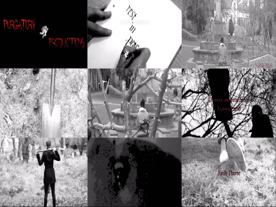
In the first frame, is our production logo. Naturally we chose this as it is an important part of a film, it part advertisement, part informative. It informs the viewer who has produced the film and encourages them to see what other films they have produced.
The third frame is our setting/location. We chose a mid-long shot in order for the audience to see the location better and to see one of the characters.
We chose this location in order for the audience to know that wherever you are then anything can happen to you whether you know it or not. The fact that she next to a church would make you think that she is at least protected but she's not.
The fourth frame shows one of the props we have used--the shovel. It also shows part of the shoes our antagonist is wearing. The antagonist is shown from the back so the audience doesn't really get a clear view of the antagonist because the face is not shown. This gives the audience a burning desire to find out who the character is and what their background story could be. This is the shovel used to dig up the grave for the burial of the protagonist.
The fifth square represents camerawork and editing, though mostly camerawork. The shot here is a long shot, with the protagonist framed by the branches and evident thorns. The mis- en- scene here is interesting, and was captured by our camerawoman.
The next shot is of the antagonist burying the main character, with the shovel. This represents our story as the title is, 'Rest In Peace' and this shot conveys to the audience the pinnacle of our opening scene, when we see the protagonist buried alive.
The next shot is of the antagonist, with the shovel sitting across the back of her shoulders. I have chosen this shot because it highlights the fact that our antagonist is a female, as opposed to horror films that commonly use a male as the antagonist. One could say that the antagonist looks extremely satisfied with what she has done depending on her body language.
The eighth shot is of our protagonist waking up from being unconscious. In this shot the protagonist looks confused as to where she is as we can see from the extreme close up of her eye. We decided to use this to emphasise the fact that she is not dead but just buried alive and it can make it easier for the audience to understand. It was pretty hard with this shot because we didn't have enough light and we had to keep changing the effects because we couldn't find the perfect effect to use but we finally found it. We used the clip effects on iMovie to do this.
The last and final shot is of the protagonist's feet being dragged along the ground. This is the instance when she is knocked unconscious for the antagonist to bury her in a grave.
[NEED TO FINISH0
Subscribe to:
Comments (Atom)

.bmp)
.bmp)


