Wednesday, 21 November 2012

Genre Research: Gothic Horror

The Gothic horror genre creates feelings of gloom, mystery, and suspense and tends to be dramatic and includes the sensational such as incest, diabolism, and nameless terrors. The majority of an audience would immediately recognize the genre when one encounters it in novels, poetry, plays, movies, and TV series. For some of us the prospect of safely experiencing dread or horror is thrilling and enjoyable. 

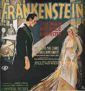
Gothicism's origin is attributed to the English author Horace Walpole, in his 1764 novel The Castle of Otranto, which was subtitled "A Gothic Story". The effect of Gothic fiction feeds on a pleasing sort of terror, an extension of Romantic literary pleasures that were relatively new at the time of Walpole's novel. Another important literary work attributed to Gothic fiction/horror is Mary Shelley's Frankenstein, also entitled A Modern Prometheus
Gothic literature is intimately associated with the Gothic Revival architecture of the same era. In a way similar to the Gothic revivalists' rejection of the clarity and rationalism of the neoclassical style of the Enlightened Establishment, the literary Gothic embodies an appreciation of the joys of extreme emotion, the thrills of fearfulness and awe inherent in the sublime, and a quest for atmosphere.

The ruins of Gothic buildings gave rise to multiple linked emotions by representing the inevitable decay and collapse of human creations — thus the urge to add fake ruins as eyecatchers in English landscape parks. English Gothic writers often associated medieval buildings with what they saw as a dark and terrifying period, characterized by harsh laws enforced by torture, and with mysterious, fantastic, and superstitious rituals. In literature such Anti-Catholicism had a European dimension featuring Roman Catholic institutions such as the Inquisition (in southern European countries such as Italy and Spain).
Friday, 16 November 2012

Ideas For Credits In Main Task

To have the names/titles written on the labels of medicine or product bottles. Here, the bottles are just usual household liquids that I found in our bathroom. I think this would be very effective if our film were to focus on poisioning or a similar area. However, I think that this would be very difficult to achieve on the MAC's editing program, as the type on the bottles is very small. It would be possible, if we made the camera pan and zoom. If we were to use a shot similar to the ones above, we could re-create the lables on the bottles, changing the ingredients to substances of interest in the film. For example, potassium/hydrogen cyanide. Futhermore, if we were to use different tinted glass bottles, then we would be able to fill the clear glass ones with coloured water. This idea would work well with the genre of horror because some poisons can cause a very slow, painful death, which could be very horrific to watch.


Another idea I have come up with is to have the writing on ( or to do with) sweets, in this case, personalized sweets Leon Paul. As sweets usually have the connotations of happiness, innocence and childishness, I thought it might be interesting to put a sinister twist to them. However, much like the first idea, it is complex and may require further planning. In addition, 

Wednesday, 7 November 2012

Title Credit Analysis: Se7en


In the establishing shot, the audience are shown a close-up of what appears to be a book or a newspaper. The book seems to be in a bad state of repair, perhaps indicating to the audience that it is used often or transported to different locations. In the background, one can see a blurred shape moving, presumably, a hand.  A high contrast/dark colour scheme has been used to reflect the darkness of the plot of the film, immediately showing the audience what genre the film is. The background lighting is surprisingly mellow, but in between the pages of book, where the light cannot reach, it is dark, possibly implying that the contents of the book are depraved, as darkness is usually associated with evil. Uncanny, non-diegetic music has been used to overlay the sequence, sounding very much like the recording of a storm, perhaps indicating that wicked or unchangeable is brewing. The titles appear in a inconsistent flashing motion, the names presented in a font that appears to have carved into a hard surface, as it is thin, sharp and angular. The ‘non-names’ as written in a thicker, rounder, bolder font, contrasting ably with the jagged font of the names. 

Here, the audience sees a drawing/picture of a pair of hands with the joints dislocated placed over square graph paper, making the audience wonder what the yet-to-be-unveiled person is up to. The light shines onto the page from the left-hand side, illuminating the page. A thin, dark shadow passes over the page twice, again indicating a human presence. The same, uncanny, electrical music continues, accompanied with a strange rattling noise. Space has been effectively used, allowing the audience to see both the picture and read the title, which is verging into darkness. The height of the shot places the audience in antagonist’s role, allowing them to see from his perspective. The proportion of the hands makes one think that they maybe life-sized drawings, again making the audience deliberate why this person would have very detailed drawing of hands with dislocated finger joints.


In this extreme close up shot, the antagonist is slicing the skin of his fingers off. Being this close to an action that may cause pain makes the viewer feel uncomfortable. The fact that this has been shown to the audience indicates importance, especially as it is taking place in the first five minutes of the film. It suggests that fingers or perhaps fingerprints are of utmost importance. The lighting helps to emphasize this, as it falls directly on the fingertips and shines through the skin that has been cut off, as well as reflecting off the edge of the blade/razor. One can see that the character has very short, dirty nails, suggesting that he works predominantly with his hands, and combined with the action or removing the skin from his fingers suggests a criminal nature. As skin grows back fast (two weeks onwards), suggests that he is planning some nefarious. The bass-heavy, non-diegetic music continues, but spikes into a noise much like that of a cassette being rewound very fast.


Further along in the opening, the audience sees this photo to a hugely gluttonous man that the antagonist most likely took. The picture is in black and white, perhaps suggesting that the antagonist has and old camera, but more likely to enhance the contrast of the victim's face via the lighting. The audience now begins to see the antagonist's sadism, through this picture and many others that are scattered through out the beginning. 

Friday, 2 November 2012

Title Credit Analysis: Final Destination 5


The first title we see appear are the presenters of the film, written in light yellow on a black background, immediately creating a stark contrast. The colour yellow is usually associated with joy, happiness, intellect, and energy, the opposite of the depressing, deathly, evil, and mysterious black, giving the audience insight about what the film may be about; energy and life surrounded by evil and death. The letters are in capitals and in an easy to read font, perhaps Arial, making it easier for the audience to read it before an 'event' takes place. The titles do not fill the space, making them look isolated, hinting to the audience the feelings that the characters may have within the narrative. The non-diegetic music accompanying the credits is slow, foreboding  but tense, pitching and leading into a climax as a explosion shatters the glass of the screen. This effect is brilliant and unpredictable, as the audience was prepared for the credits to fade in as done previously  to the sinister music.

In this shot, a different explosion has shattered the glass, with the credits still visibly painted on the glass in silver. To create tension, high violin/string music has been used to overlay the action. The speed of the glass exploding has been altered. It is very fast to begin with and then suddenly slowed down, allowing the audience to see the wonderful, fiery explosion that shatters the glass. Also, the fire, particularly if seen on a large cinema screen, would be very bright, again contrasting with black background, suggesting danger yet again.
Here, the shattering of the glass has been reversed, so that it pieces itself back together to form the whole screen. This is unusual and not what the audience was expecting as they were assuming the same to happen to this title as had occurred to all the other titles, namely the glass to explode towards them. Furthermore, one sees the object that shattered the glass, namely scissors, which is rather fitting when one notices that the credit is for the costume designer. After that sequence, we see what the breaking of the glass by the scissors looked like for no apart reason at all. Perhaps to extent the time of a rather tedious film or maybe to increase its pretentiousness.  The same dramatic, non-diegetic music accompanies the scene, with a slight suction noise as the shattered glass reverts back into the screen. 

As the titles list the actors, objects shatter the glass, specifically the ones that kill them in the film. Here, it is, ironically, a window. If one looks carefully, one can see that the window is in fact on fire, which is an impressive feat. During this sequence, the music has, surprisingly, changed. It punctuates the sequence with a series of stresses that shifted from beat one and four, to one and three, very similar to the ‘melody’ used for Hitchcock’s “Psycho".
  
In the final shot that I will be analyzing, the audience, in an unusual move from the director, are shown the ending of the film. An aeroplane explodes and various objects of debris break the glass. Again, the smashing of the glass is sped up and then slowed down for extra impact and amazement. The music in the segment begins to pick up, slowly striving for a climax, even though the ending for the film has been revealed. Curiously, the space here has been used differently. In the other sequences, the objects breaking the glass were in close proximity. Here, the main object, the aeroplane is far above the audience and the titles, giving the impression the dark background is in fact a night sky. In addition, the explosion of the plane lights up the screen and later reflects in the pieces of broken glass.